Forms
Toggle
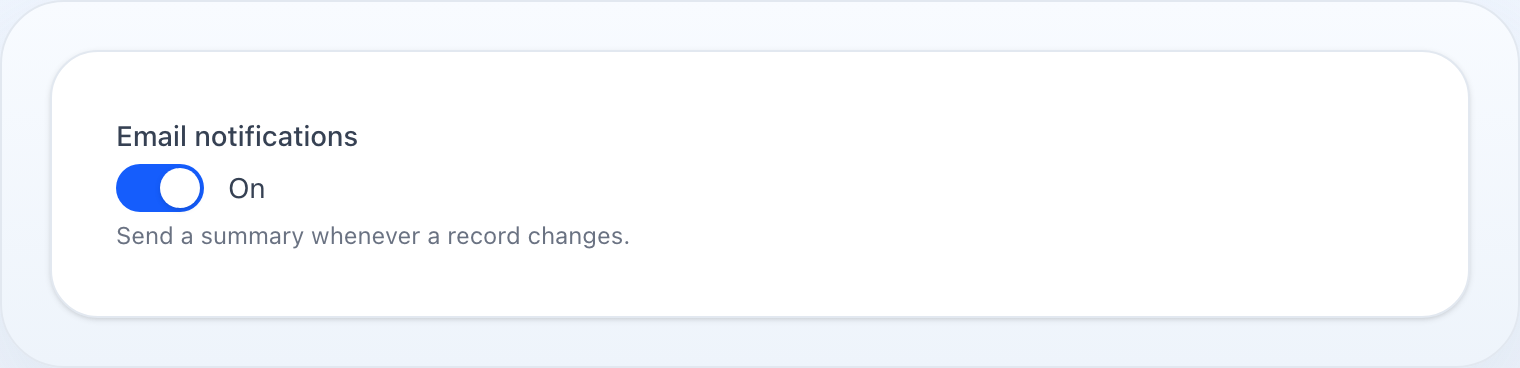
A boolean as a switch, with the colours, icons and labels each state carries.
On this page
A switch. Toggle holds the same boolean a Checkbox does, and
the difference is what it says to the user: a checkbox is a statement you agree
to, a toggle is a setting you turn on. Settings screens want toggles; terms and
conditions want checkboxes.
use NyonCode\WireForms\Components\Toggle;
How It Works
A toggle is a field: a value at its state path, validated like any other.
Its state type is bool, so a blank schema seeds it as false rather than
null.
The switch itself is Alpine. The rendered control is a <button role="switch"> whose state lives in an x-data entangled with the field's
wire:model, so the knob slides the moment it is clicked, before any round trip.
The entanglement is what carries the change back to the server, and it honours
live() the same way the slider and tags fields do.
Colours are track colours, and they are resolved server-side. onColor()
defaults to primary, offColor() to gray, and both are turned into class
strings that Alpine swaps between. Any palette colour works — see
Colors.
The on/off labels are one element, not two. The label span is rendered only
if onLabel() or offLabel() is set, and it shows enabled ? onLabel : offLabel. So setting only one of them gives you an empty label in the other
state rather than no label — if you set one, set both.
Icons live inside the knob and are independent of the labels: onIcon()
shows while on, offIcon() while off, each with x-cloak so neither flashes
before Alpine boots.
inline() currently does nothing here. It is declared and defaults to
true, but toggle.blade.php never reads isInline() — only
Radio and CheckboxList consume it. The
toggle's own layout is a fixed flex items-center gap-3.
Basic Usage
Toggle::make('is_active') ->label('Active') ->default(true)
Colours And Icons
Toggle::make('notifications_enabled') ->label('Notifications') ->onColor('success') ->offColor('danger') ->onIcon('outline:check') ->offIcon('outline:x-mark')
Words For Each State
Set both, or neither:
Toggle::make('visibility') ->label('Listing') ->onLabel('Public') ->offLabel('Private')
Reacting To It
Toggle::make('advanced_mode') ->label('Advanced mode') ->live(), TextInput::make('webhook_url') ->url() ->visibleWhen('advanced_mode'),
Extended Example
A notification settings screen in a real Livewire host, where one toggle governs the rest:
use Livewire\Component;use NyonCode\WireCore\Foundation\Schema\Section;use NyonCode\WireForms\Components\Toggle;use NyonCode\WireForms\Forms\Form;use NyonCode\WireForms\Forms\WithForms; class NotificationSettings extends Component{ use WithForms; public ?array $data = []; public function form(Form $form): Form { return $form ->statePath('data') ->model(User::class) ->schema([ Toggle::make('notifications_enabled') ->label('Send me notifications') ->onLabel('On') ->offLabel('Off') ->onColor('success') ->live(), Section::make('channels') ->label('Channels') ->visibleWhen('notifications_enabled') ->schema([ Toggle::make('notify_email')->label('E-mail'), Toggle::make('notify_sms')->label('SMS'), Toggle::make('notify_push') ->label('Push') ->disabled(fn (): bool => ! auth()->user()->hasDevice()), ]), ]) ->successMessage('Settings saved'); } public function save(): void { $this->form->save(); }}
The master toggle is live() because the section below it is conditioned on its
value; the inner toggles are not, because nothing re-renders when they change.
Toggle API
->onLabel(string|Closure|null $label) // word shown while on — set this and offLabel together->offLabel(string|Closure|null $label) // word shown while off->onColor(string|Color $color) // track colour while on — default 'primary'->offColor(string|Color $color) // track colour while off — default 'gray'->onIcon(string|Icon|null $icon) // icon inside the knob while on->offIcon(string|Icon|null $icon) // icon inside the knob while off->inline(bool $condition = true) // declared, but this field's view does not read it->getOnLabel(): ?string->getOffLabel(): ?string->getOnColor(): string->getOffColor(): string->getOnIcon(): ?string->getOffIcon(): ?string->getOnColorClasses(): string->getOffColorClasses(): string->isInline(): bool->getStateType(): string // 'bool'
Labels, help text, visibility, defaults, validation and live() are shared by
every field — see Common Field API.
Related
- Checkbox — the same boolean as a statement to agree to
- Colors — the palette
onColor()draws from - Icons — the names
onIcon()takes - Reactive fields — what
live()andvisibleWhen()do