Forms
Select
Dropdown select with static or dynamic options, search, and multi-select.
On this page
Dropdown select with static or dynamic options, search, and multi-select.
use NyonCode\WireForms\Components\Select;Mobile. The dropdown/search panel opens as a bottom sheet below the configured breakpoint (searchable selects stay a floating panel by default so the search box stays usable). Override per field with
->sheetOnMobile()/->mobileBreakpoint('md')— see mobile presentation.
Basic Usage
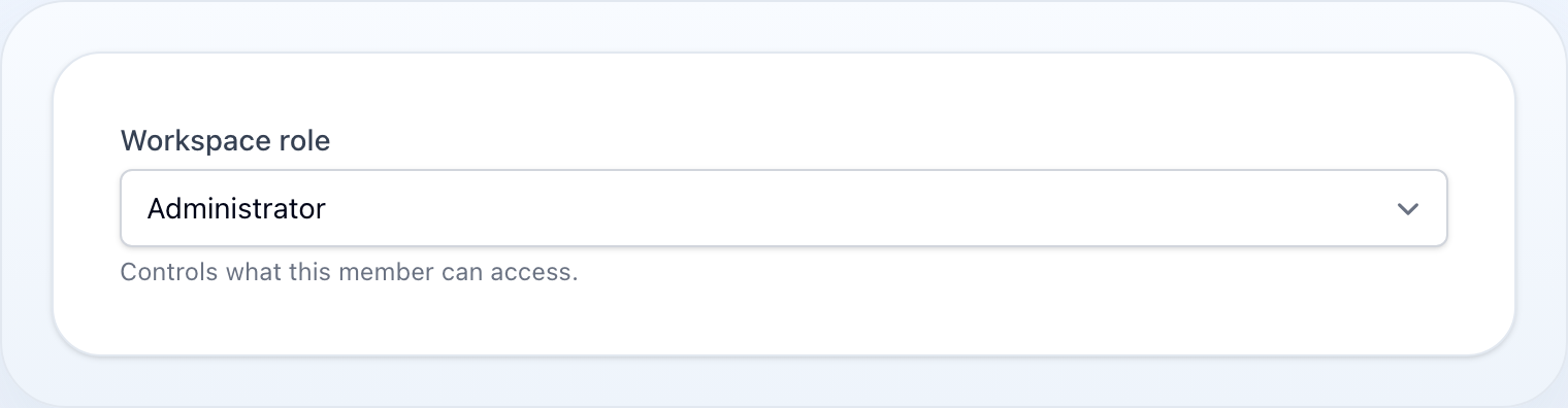
Select::make('role') ->options([ 'admin' => 'Administrator', 'editor' => 'Editor', 'user' => 'User', ])Dynamic Options
Select::make('category_id') ->options(fn () => Category::pluck('name', 'id')->toArray()) ->placeholder('Choose category')Enum Options
Pass a PHP enum class directly instead of an array — the cases are expanded to a
value => label map. The key is the backing value (or the case name for unit enums),
and the label comes from the enum's getLabel() when it implements the
Foundation\Contracts\Enum\HasLabel contract, falling back to a headline of the case name.
use NyonCode\WireCore\Foundation\Contracts\Enum\HasLabel; enum Status: string implements HasLabel{ case Draft = 'draft'; case Published = 'published'; public function getLabel(): ?string { return match ($this) { self::Draft => 'Draft', self::Published => 'Published', }; }} Select::make('status')->options(Status::class)// → ['draft' => 'Draft', 'published' => 'Published']An enum without HasLabel still works — the case name is headlined for the label
(LowPriority → Low Priority). A closure returning an enum class is expanded too.
Automatic validation. A single-value Select (or Radio) whose options come
from an enum is automatically constrained to those values with an in: rule — a submission
outside the enum is rejected without you restating it. It is skipped for multiple() selects
(array state) and when you declare your own in: / Rule::in() / Rule::enum() rule.
The same
->options(Enum::class)shorthand works onRadio,CheckboxList, tableSelectColumn, and the tableSelectFilter.
Searchable
Select::make('user_id') ->options(fn () => User::pluck('name', 'id')->toArray()) ->searchable() ->noSearchResultsMessage('No users found') ->searchPrompt('Type to search...') ->loadingMessage('Loading...')Remote Search
Instead of filtering a preloaded list in the browser, resolve matches on the server as the user types:
Select::make('author_id') ->getSearchResultsUsing(fn (string $search) => User::where('name', 'like', "%{$search}%")->limit(50)->pluck('name', 'id')->all() ) ->getOptionLabelUsing(fn ($value) => User::find($value)?->name)getSearchResultsUsing()impliessearchable()and returns avalue => labelmap.getOptionLabelUsing()(single) /getOptionLabelsUsing()(multiple) resolve the label(s) for the current selection, so the trigger stays readable even when the chosen option was never preloaded.preload()eagerly seeds the remote list on render (runs the search callback with an empty term) instead of waiting for the first keystroke.
The host must expose the search endpoint — any WithForms component or a table
action modal does. A BelongsToSelect gets relationship-driven
remote search automatically.
Create & Edit Options
Let the user create a new option — or edit the selected one — from a modal without leaving the form:
Select::make('category_id') ->options(fn () => Category::pluck('name', 'id')->all()) ->createOptionForm([ TextInput::make('name')->required(), ]) ->createOptionUsing(fn (array $data) => Category::create($data)->getKey()) ->editOptionForm([ TextInput::make('name')->required(), ]) ->fillEditOptionUsing(fn ($value) => Category::find($value)->only('name')) ->updateOptionUsing(fn ($value, array $data) => Category::find($value)->update($data))A "+ Create" (and, for a selected value, "Edit") affordance appears in the combobox panel footer and opens an isolated modal. Validation keeps the modal open with errors; on success the new value is selected (appended for a multi-select).
createOptionUsing()returns the new option's value — a scalar key, or a model whose key is used.- Editing targets the single selected option, so it is unavailable on
multiple(). createOptionModalHeading()/editOptionModalHeading()customise the headings.- Works in standalone
WithFormscomponents and inside table action modals. - So the newly created value renders a label, pair with
getOptionLabelUsing()or a preloaded option list. - The created/edited option is merged into the open combobox immediately (the host
dispatches
select-option-created/select-option-updatedbrowser events) — no page refresh needed.
Reactivity
The combobox binds deferred by default. Add live() when other fields react to the
selection — afterStateUpdated(), a sibling's visibleWhen(), or Form::live() —
so picking an option syncs to the server on click instead of waiting for the next
roundtrip:
Select::make('type') ->options([...]) ->live() ->afterStateUpdated(fn ($state, $set) => $set('label', ucfirst((string) $state)))Multi-Select
Select::make('tags') ->multiple() ->maxItems(5) ->minItems(1) ->options([...])Relationship
Select::make('author_id') ->relationship('author', 'name') ->searchable()Native vs Custom
Every Select renders through the custom combobox by default, so searchable and
non-searchable selects share one design — searchable() simply adds
the in-panel search input. Use native() to opt into the browser-native
<select> element instead.
Select::make('country') ->searchable() // combobox with a search input ->native() // force the browser-native <select> insteadBoolean Select
Select::make('active') ->boolean() // Yes/No optionsDisabled Options
Render specific options as non-selectable:
Select::make('status') ->options([ 'draft' => 'Draft', 'review' => 'In Review', 'published' => 'Published', 'archived' => 'Archived', ]) ->disabledOptions(['archived'])Dynamic disabled options:
Select::make('tier') ->options(Plan::pluck('name', 'id')->toArray()) ->disabledOptions(fn () => Plan::unavailable()->pluck('id')->toArray())Methods
| Method | Type | Description |
|---|---|---|
options(array|string|Closure) |
array | Static, dynamic, or enum-class options (value => label) |
searchable() |
bool | Enable option search |
multiple() |
bool | Allow multiple selections |
native(bool $native = true) |
bool | Use the browser-native <select> instead of the combobox (default: false) |
maxItems(int|null) |
int | Maximum selected items (multi-select) |
minItems(int|null) |
int | Minimum selected items (multi-select) |
disabledOptions(array|Closure) |
array | Option keys that are rendered as disabled |
noSearchResultsMessage(string|null) |
string | Message when search finds nothing |
loadingMessage(string|null) |
string | Message while options are loading |
searchPrompt(string|null) |
string | Prompt shown in the search box |
boolean() |
— | Shorthand for Yes/No options |
relationship(string, string) |
— | Load options from a relationship |
getSearchResultsUsing(Closure) |
— | Remote search: resolve matches on the server (implies searchable()) |
getOptionLabelUsing(Closure) / getOptionLabelsUsing(Closure) |
— | Resolve label(s) for the current selection |
preload() |
bool | Eagerly seed the remote option list on render |
createOptionForm(array|Closure) / createOptionUsing(Closure) |
— | Create a new option from a modal |
editOptionForm(array|Closure) / fillEditOptionUsing(Closure) / updateOptionUsing(Closure) |
— | Edit the selected option from a modal |
createOptionModalHeading(string) / editOptionModalHeading(string) |
string | Modal headings |
placeholder(string|Closure) |
string | Empty/blank option label |
disabled(bool|Closure) |
bool | Disable the select |
required() |
— | Mark as required |
live() |
— | Trigger Livewire update on change |
See Common Field API for label, hint, tooltip, and other shared methods.