Core
Widgets
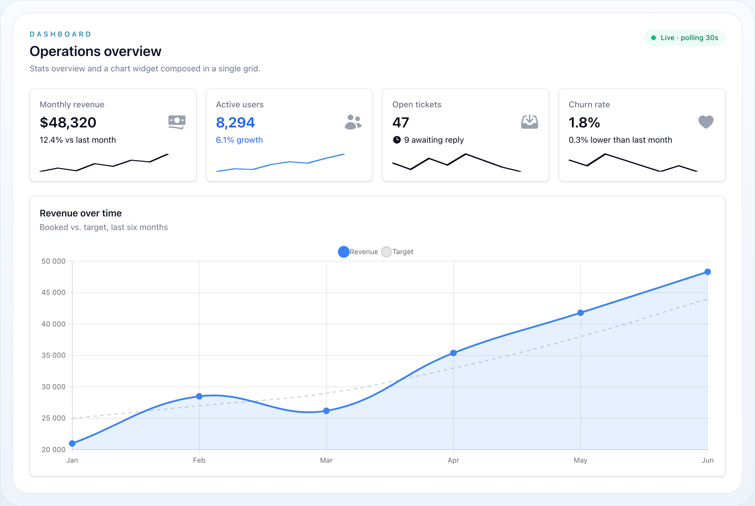
The Widget module provides dashboard components — stats cards, charts, embedded tables, and custom views. Widgets live in wire-core and can be composed into responsive grid layouts on any Livewire component.
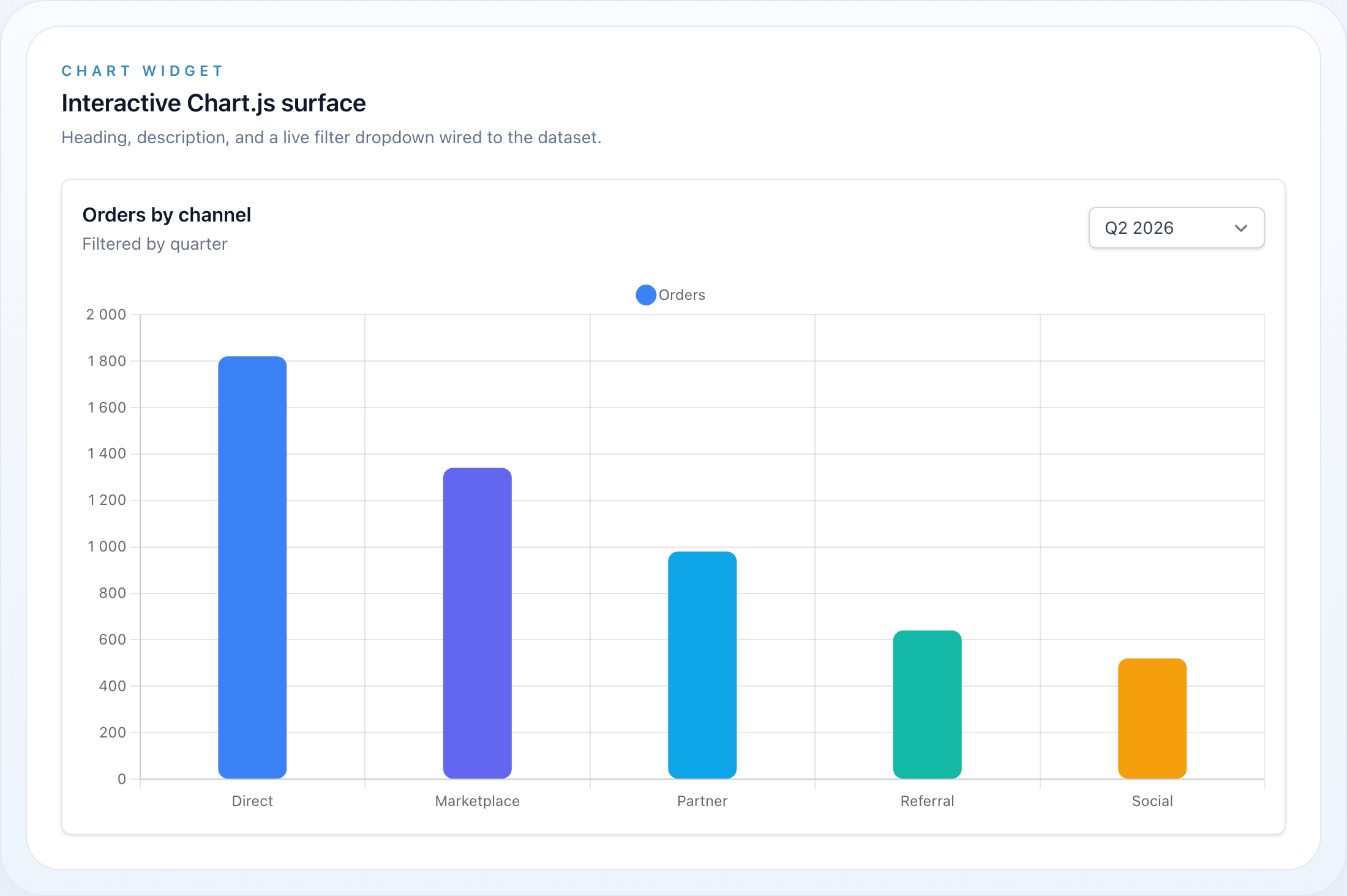
A single chart widget with heading, description, and a live quarter filter.
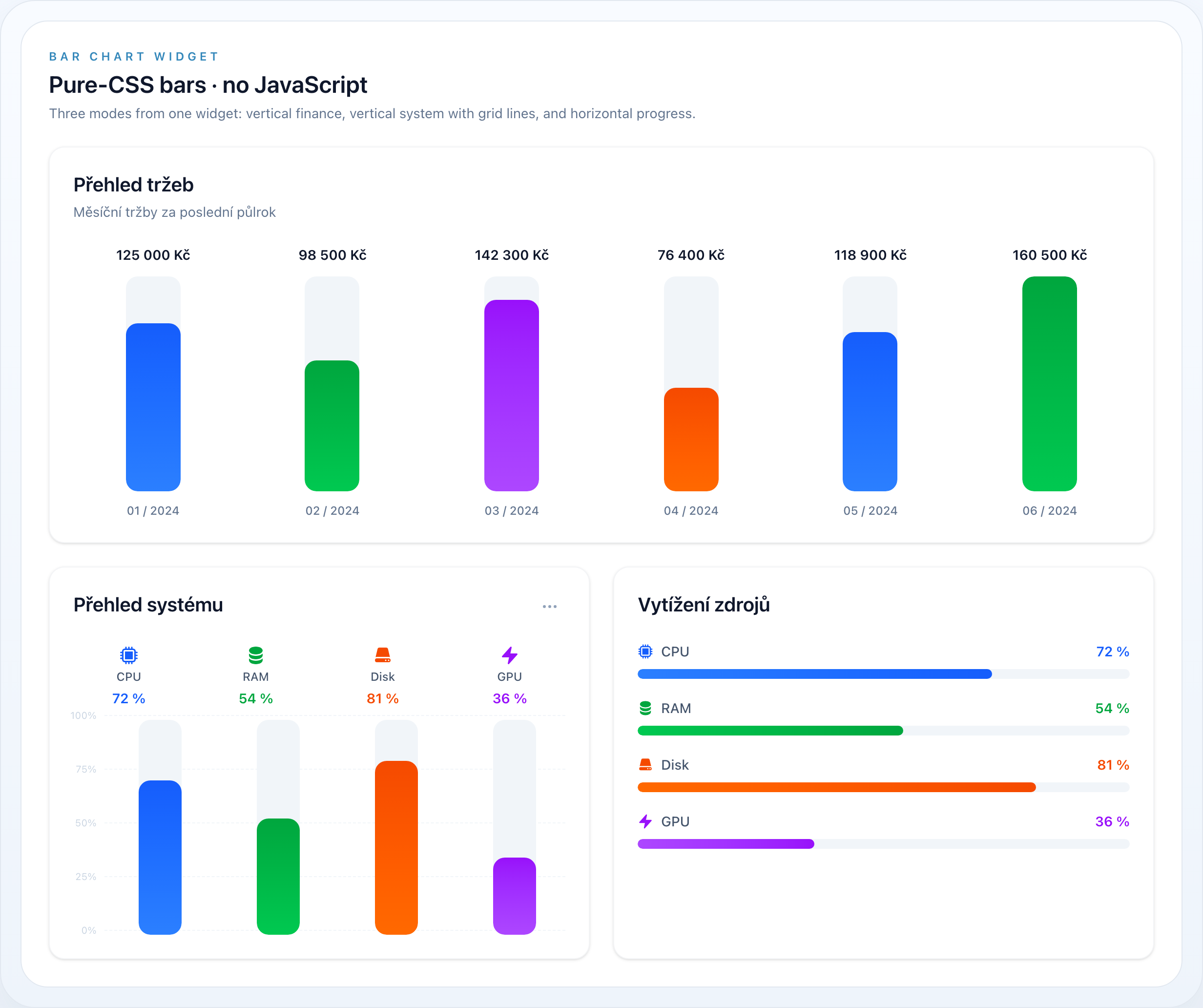
Pure-CSS bars: vertical finance, vertical system metrics with grid lines, and horizontal progress.
On this page
- Widget types at a glance
- Table of Contents
- Widget Base
- StatsOverviewWidget
- Basic Usage
- Grid Columns
- StatsOverviewWidget API
- Stat
- Full Example
- Sparkline Chart
- Stat API
- ChartWidget
- Basic Usage
- Chart Types
- Dynamic Data with Closures
- Filter Dropdown
- ChartWidget API
- Convenience Widgets
- Chart.js Options
- BarChartWidget
- Finance bars
- System metrics (vertical, with grid lines)
- System metrics (horizontal)
- How fill height is resolved
- Safe colors
- Validation
- BarChartWidget API
- ChartItem
- ChartItem API
- TableWidget
- Basic Usage
- TableWidget API
- CustomWidget
- Basic Usage
- CustomWidget API
- Polling
- Usage
- Polling API
- Dashboard Layout (WithWidgets)
- Usage
- Blade Template
- WithWidgets API
- HasWidgets Interface
- Authorization
- Widget API Reference
- Widget (base class)
- Blade Components
The Widget module provides dashboard components — stats cards, charts, embedded tables, and custom views. Widgets live in wire-core and can be composed into responsive grid layouts on any Livewire component.
Every widget shares the same fluent builder, so heading, visibility, authorization, column span, and polling work identically across all four types.
Widget types at a glance
| Widget | Class | Best for |
|---|---|---|
| Stats overview | StatsOverviewWidget |
KPIs, counters, and summary metrics with optional sparklines |
| Chart | ChartWidget |
Line, bar, pie, and doughnut charts powered by Chart.js |
| Chart presets | LineChartWidget / PieChartWidget / DoughnutChartWidget |
Declarative ChartWidget presets (pie/doughnut show the legend by default) |
| Bar chart | BarChartWidget |
Pure-CSS vertical/horizontal bars (finance, system) — no JavaScript |
| Table | TableWidget |
A compact wire-table embedded inside a dashboard card |
| Custom | CustomWidget |
Any Blade view rendered as a widget |
Mix widget types freely inside a single
WithWidgetsdashboard — each widget controls its own column span, visibility, and refresh interval. See Dashboard Layout.
Table of Contents
- Widget Base
- StatsOverviewWidget
- Stat
- ChartWidget
- BarChartWidget
- ChartItem
- TableWidget
- CustomWidget
- Polling
- Dashboard Layout (WithWidgets)
- Authorization
- Widget API Reference
Widget Base
All widgets extend NyonCode\WireCore\Widgets\Widget — an abstract class implementing Htmlable.
use NyonCode\WireCore\Widgets\Widget;Every widget supports:
->heading(?string $heading) // widget title->description(?string $description) // subtitle text->lazy(bool $lazy = true) // defer rendering->columnSpan(int|string $span) // grid column span (1-12, 'full')->extraAttributes(array $attrs) // custom HTML attributes->hidden(bool|Closure $hidden) // visibility control->visible(bool|Closure $visible) // visibility control->permission(string $permission) // authorization via Gate->authorize(string $ability) // authorization via Gate ability->authorizeUsing(Closure $callback) // custom authorization callbackWidgets render via Blade views and support toHtml() / __toString() for direct output.
StatsOverviewWidget
Grid of stat cards — ideal for KPIs, counters, and summary metrics.
The configured column count is the desktop layout: the grid always collapses
to one column on mobile and two from the sm breakpoint, growing to the
configured count (max 4) on large screens.
use NyonCode\WireCore\Widgets\StatsOverviewWidget;use NyonCode\WireCore\Widgets\Stat;Basic Usage
StatsOverviewWidget::make() ->heading('Overview') ->columns(3) ->stats([ Stat::make('Total Revenue', '$45,231') ->description('12% increase') ->descriptionIcon('arrow-up') ->color('success'), Stat::make('New Users', '1,234') ->description('3% decrease') ->descriptionIcon('arrow-down') ->color('danger'), Stat::make('Orders', '856') ->description('Same as last month') ->color('gray'), ])Grid Columns
->columns(int $columns) // 1-4 columns (clamped)Default is 3 columns. The grid is responsive.
StatsOverviewWidget API
->stats(array $stats) // array of Stat instances->getStats(): array->columns(int $columns) // grid columns (1-4)->getGridColumns(): intStat
Individual stat card within a StatsOverviewWidget.
use NyonCode\WireCore\Widgets\Stat;Full Example
Stat::make('Monthly Revenue', '$12,430') ->description('8% increase from last month') ->descriptionIcon('arrow-up') ->color('success') ->icon('currency-dollar') ->chart([7, 3, 4, 5, 6, 3, 5, 8]) ->extraAttributes(['class' => 'ring-2 ring-green-200'])Sparkline Chart
->chart(array $data) // array of numeric data points for SVG sparklineStat::make('Active Users', '2,847') ->chart([12, 15, 18, 14, 22, 25, 28, 32]) ->color('primary')Stat API
Stat::make(string $label, string $value)->description(?string $description) // secondary text->descriptionIcon(?string $icon) // icon next to description->color(?string $color) // any palette color key (e.g. 'success', 'danger', 'primary')->icon(?string $icon) // stat card icon->chart(array $data) // sparkline data points (int|float)->extraAttributes(array $attrs) // custom HTML attributes->getLabel(): string->getValue(): string->getDescription(): ?string->getDescriptionIcon(): ?string->getColor(): ?string->getIcon(): ?string->getChart(): ?array->hasChart(): boolChartWidget
Chart widget with Chart.js integration. Supports line, bar, pie, and doughnut charts.
use NyonCode\WireCore\Widgets\ChartWidget;Requires Chart.js. The widget renders a
<canvas>and initializes it through Alpine. Include Chart.js on the page — via CDN or your bundle — or the canvas stays empty and a console warning is logged. Dataset styling (borderColor,fill,tension, …) is passed straight through to Chart.js.
Basic Usage
ChartWidget::make() ->heading('Revenue Over Time') ->type('line') ->labels(['Jan', 'Feb', 'Mar', 'Apr', 'May', 'Jun']) ->datasets([ [ 'label' => 'Revenue', 'data' => [1200, 1900, 3000, 5000, 2300, 3200], 'borderColor' => '#3B82F6', ], ])Chart Types
->type('line') // line chart (default)->type('bar') // bar chart->type('pie') // pie chart->type('doughnut') // doughnut chartDynamic Data with Closures
Datasets and labels accept Closures. The active filter value is passed as argument:
ChartWidget::make() ->heading('Sales') ->type('bar') ->filter(['2025' => '2025', '2026' => '2026'], '2026') ->labels(fn (?string $filter) => match($filter) { '2025' => ['Q1', 'Q2', 'Q3', 'Q4'], '2026' => ['Q1', 'Q2'], default => [], }) ->datasets(fn (?string $filter) => [ ['label' => 'Sales', 'data' => $filter === '2025' ? [100, 200, 150, 300] : [180, 250]], ])Filter Dropdown
->filter(array $options, ?string $default = null)Adds a dropdown filter on the widget. The selected value is passed to dataset/label closures.
ChartWidget::make() ->heading('Revenue') ->filter([ 'week' => 'This Week', 'month' => 'This Month', 'year' => 'This Year', ], 'month')ChartWidget API
->type(string $type) // 'line', 'bar', 'pie', 'doughnut'->getType(): string->datasets(array|Closure $datasets) // Chart.js dataset format->getDatasets(): array->labels(array|Closure $labels) // x-axis labels->getLabels(): array->filter(array $options, ?string $default) // dropdown filter options->getFilterOptions(): ?array->hasFilter(): bool->getActiveFilter(): ?string->activeFilter(?string $filter) // set active filter programmatically->options(array $options) // Chart.js options merged over the type defaults->getOptions(): arrayConvenience Widgets
Declarative presets over ChartWidget, so a dashboard states intent instead of ->type(...):
use NyonCode\WireCore\Widgets\DoughnutChartWidget;use NyonCode\WireCore\Widgets\LineChartWidget;use NyonCode\WireCore\Widgets\PieChartWidget; LineChartWidget::make()->heading('Revenue')->labels([...])->datasets([...]);PieChartWidget::make()->heading('By Category')->labels([...])->datasets([...]);DoughnutChartWidget::make()->heading('By Status')->labels([...])->datasets([...]);PieChartWidget and DoughnutChartWidget show the Chart.js legend by default (top position) — pie slices rely on it. Everything else matches ChartWidget.
Chart.js Options
Override any Chart.js option with options(); the array is merged over the type's defaults (responsive: true, maintainAspectRatio: false, plus the pie/doughnut legend), so you only specify what changes:
LineChartWidget::make() ->datasets([...]) ->options([ 'scales' => ['y' => ['beginAtZero' => true]], 'plugins' => ['legend' => ['display' => false]], ])BarChartWidget
A dependency-free bar chart rendered entirely with Tailwind utility classes — no Chart.js, no <canvas>, no JavaScript. Use it for compact, print-friendly dashboards. It is a distinct widget from ChartWidget; both can live on the same dashboard.
use NyonCode\WireCore\Widgets\BarChartWidget;use NyonCode\WireCore\Widgets\ChartItem;The widget has three visual modes, picked from type() + variant():
type() |
variant() |
Look |
|---|---|---|
vertical |
finance |
Vertical bars: formatted value above, light max-height track, MM / YYYY caption below |
vertical |
system / default |
Vertical bars on a 0–100% track with an icon + label + percentage header and optional grid lines |
horizontal |
system / default |
Horizontal progress bars: label on the left, value on the right |
Finance bars
BarChartWidget::make() ->heading('Přehled tržeb') ->type('vertical') ->variant('finance') ->items([ ChartItem::make('01 / 2024')->value(125000)->formattedValue('125 000 Kč')->color('blue')->percentage(70), ChartItem::make('02 / 2024')->value(98500)->formattedValue('98 500 Kč')->color('green')->percentage(55), ])System metrics (vertical, with grid lines)
BarChartWidget::make() ->heading('Přehled systému') ->type('vertical') ->variant('system') ->showGrid() // 0% / 25% / 50% / 75% / 100% guide lines ->showMenu() // a "⋯" options affordance in the card header ->maxValue(100) // percentage mode (0–100 track) ->verticalLabels() // rotate each bar's label vertically beside it (fits long names) ->items([ ChartItem::make('CPU')->value(72)->formattedValue('72 %')->icon('cpu-chip')->color('blue')->percentage(72), ChartItem::make('RAM')->value(54)->formattedValue('54 %')->icon('circle-stack')->color('green')->percentage(54), ChartItem::make('Disk')->value(81)->formattedValue('81 %')->icon('server')->color('orange')->percentage(81), ChartItem::make('GPU')->value(36)->formattedValue('36 %')->icon('bolt')->color('purple')->percentage(36), ])System metrics (horizontal)
Same items, switch type('horizontal'):
BarChartWidget::make() ->type('horizontal') ->variant('system') ->maxValue(100) ->items([ /* ChartItem… */ ])How fill height is resolved
Each bar's fill percentage (percentageFor(ChartItem)) is resolved in this order:
- An explicit per-item
->percentage(0–100)wins. - Otherwise the value is scaled against the widget
->maxValue(). - Otherwise (percentage mode with no ceiling) the value is auto-scaled against the largest item.
The result is always clamped to 0–100. The fill size is the only dynamic style, passed as a CSS variable and consumed by Tailwind arbitrary values:
<div class="… h-[var(--value)]" style="--value: 72%"></div>Safe colors
color() values map through a fixed allow-list (HasColor::getGradientFillClasses() / getFillTextClasses()) — owner-supplied strings can never inject arbitrary classes. Supported chart hues:
| key | fill gradient | accent text |
|---|---|---|
blue |
from-blue-500 to-blue-600 |
text-blue-600 |
green |
from-green-500 to-green-600 |
text-green-600 |
orange |
from-orange-500 to-orange-600 |
text-orange-600 |
purple |
from-purple-500 to-purple-600 |
text-purple-600 |
gray |
from-slate-400 to-slate-500 |
text-slate-600 |
(The brand primary alias and the wider palette vocabulary — red, amber, cyan, pink, … — are accepted too.)
Validation
->type('diagonal'); // throws InvalidArgumentException (allowed: vertical, horizontal)->variant('pie'); // throws InvalidArgumentException (allowed: finance, system, default)ChartItem::make('CPU')->percentage(120); // throws InvalidArgumentException (0–100)BarChartWidget API
->type(string $type) // 'vertical' | 'horizontal' (validated)->getType(): string->variant(string $variant) // 'finance' | 'system' | 'default' (validated)->getVariant(): string->items(array $items) // array<ChartItem> (validated)->getItems(): array->showGrid(bool $show = true) // grid lines (system vertical)->shouldShowGrid(): bool->showMenu(bool $show = true) // card-header options affordance->shouldShowMenu(): bool->maxValue(int|float|null $max) // absolute ceiling; null = percentage mode->getMaxValue(): ?float->height(int $px) // vertical plot height (default 240)->getHeight(): int->verticalLabels(bool $on = true) // rotate each bar's label vertically beside it (vertical charts; fits long names)->hasVerticalLabels(): bool->rounded(string $scale) // card radius: 'lg' | 'xl' | '2xl' (default) | '3xl' | …->getRounded(): string->percentageFor(ChartItem $item): float // resolved 0–100 fill->fillClassesFor(ChartItem $item): string // safe gradient classes->textClassesFor(ChartItem $item): string // safe accent text classesChartItem
A single bar in a BarChartWidget.
use NyonCode\WireCore\Widgets\ChartItem;ChartItem API
ChartItem::make(string $label)->value(int|float $value) // raw numeric value->getValue(): float->formattedValue(?string $formatted) // display string, e.g. '125 000 Kč' / '72 %'->getFormattedValue(): string // falls back to the raw value->color(string|Color|null $color) // safe color key (default 'primary')->getColor(): string->percentage(int|float $percentage) // explicit 0–100 fill (validated)->getPercentage(): ?float->hasPercentage(): bool->icon(string|Icon|null $icon) // icon name (system/horizontal variants)->getIcon(): ?string->getLabel(): string->extraAttributes(array $attrs)TableWidget
Embeds a wire-table inside a widget. Useful for compact data views in dashboards.
use NyonCode\WireCore\Widgets\TableWidget;Basic Usage
TableWidget::make() ->heading('Recent Orders') ->table(fn (Table $table) => $table ->columns([ TextColumn::make('number')->searchable(), TextColumn::make('customer.name'), TextColumn::make('total')->money('CZK'), BadgeColumn::make('status')->colors([...]), ]) ->query(Order::query()->latest()->limit(10)) )TableWidget API
->table(Closure $callback) // fn(Table $table): Table->getTableCallback(): ?ClosureCustomWidget
Renders a custom Blade view as a widget.
use NyonCode\WireCore\Widgets\CustomWidget;Basic Usage
CustomWidget::make() ->heading('Quick Links') ->view('dashboard.quick-links') ->viewData(['links' => $this->getLinks()])CustomWidget API
->view(string $view) // Blade view name->viewData(array $data) // data passed to view->getCustomView(): ?stringPolling
All widgets support auto-refresh via Livewire polling.
use NyonCode\WireCore\Widgets\Concerns\HasPolling;Usage
StatsOverviewWidget::make() ->pollingInterval('30s') ->stats([...]) ChartWidget::make() ->pollingInterval('60s') ->pollingOnlyVisible() // pause polling when widget is off-screenPolling API
->pollingInterval(?string $interval) // '5s', '10s', '30s', '60s', etc.->getPollingInterval(): ?string->isPolling(): bool->pollingOnlyVisible(bool $only = true) // only poll when visible in viewport->isPollingOnlyVisible(): bool->getPollingDirective(): ?string // returns wire:poll directive stringPolling is visibility-aware by default.
pollingOnlyVisibledefaults totrue, so widgets usewire:poll.visibleand pause requests while scrolled out of view. Call->pollingOnlyVisible(false)to keep refreshing off-screen.
Dashboard Layout (WithWidgets)
Use the WithWidgets trait on a Livewire component to compose a widget dashboard.
use NyonCode\WireCore\Widgets\Concerns\WithWidgets;use NyonCode\WireCore\Widgets\Contracts\HasWidgets;Usage
class Dashboard extends Component implements HasWidgets{ use WithWidgets; protected function getWidgets(): array { return [ StatsOverviewWidget::make() ->columns(4) ->stats([ Stat::make('Users', User::count()), Stat::make('Orders', Order::count()), Stat::make('Revenue', '$' . number_format(Order::sum('total'), 2)), Stat::make('Products', Product::count()), ]), ChartWidget::make() ->heading('Monthly Revenue') ->type('line') ->columnSpan(2) ->labels($this->getMonthLabels()) ->datasets($this->getRevenueDatasets()), TableWidget::make() ->heading('Recent Orders') ->table(fn ($table) => $this->configureRecentOrdersTable($table)), ]; } protected function getWidgetColumns(): int { return 2; // 2-column grid layout }}Each widget is also Htmlable, so you can skip the component and lay them out
yourself: @foreach ($this->getVisibleWidgets() as $widget) {{ $widget }} @endforeach.
WithWidgets API
abstract protected function getWidgets(): array // define widgetsprotected function getWidgetColumns(): int // grid columns (default: 2)public function getVisibleWidgets(): array // filtered by visibility + authorizationHasWidgets Interface
interface HasWidgets{ public function getWidgets(): array;}Authorization
Widgets inherit authorization from HasVisibility which uses the HasAuthorization trait. See Authorization for details.
StatsOverviewWidget::make() ->permission('view-dashboard-stats') ->stats([...]) ChartWidget::make() ->authorize('view-revenue-chart') ->heading('Revenue') CustomWidget::make() ->authorizeUsing(fn ($user) => $user->hasRole('manager')) ->view('dashboard.manager-panel')Unauthorized widgets are automatically excluded from getVisibleWidgets().
Widget API Reference
Widget (base class)
Widget::make(): static // static factory->heading(?string $heading): static->getHeading(): ?string->description(?string $description): static->getDescription(): ?string->lazy(bool $lazy = true): static->isLazy(): bool->render(): View->toHtml(): stringInherited from traits:
// HasColumnSpan->columnSpan(int|string $span): static->getColumnSpan(): int|string // HasExtraAttributes->extraAttributes(array $attrs): static->getExtraAttributes(): array // HasPolling->pollingInterval(?string $interval): static->pollingOnlyVisible(bool $only = true): static // HasVisibility + HasAuthorization->hidden(bool|Closure $hidden): static->visible(bool|Closure $visible): static->permission(?string $permission): static->authorize(?string $ability): static->authorizeUsing(?Closure $callback): static->isVisible(): bool->isAuthorized(): boolBlade Components
{{-- Widget grid component --}}<x-wire::widget-grid :widgets="$widgets" :columns="2" /> {{-- Individual widget views --}}wire-core::widgets.stats-overviewwire-core::widgets.chartwire-core::widgets.bar-chartwire-core::widgets.bar-chart.vertical-financewire-core::widgets.bar-chart.vertical-systemwire-core::widgets.bar-chart.horizontal-systemwire-core::widgets.tablewire-core::widgets.customwire-core::widgets.widget-grid