Fields
Slider
Visual range slider for numeric values with configurable min, max, and step.
Visual range slider for numeric values with configurable min, max, and step.
use NyonCode\WireForms\Components\Slider;Basic Usage
Slider::make('volume') ->min(0) ->max(100) ->default(50)With Units
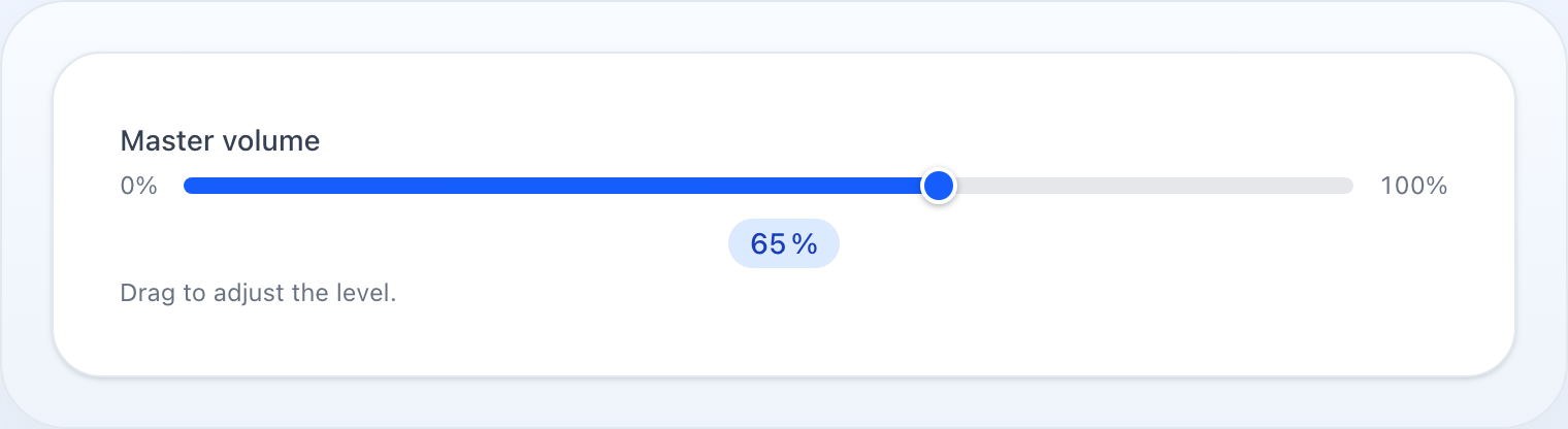
Use prefix() / suffix() to add a unit label to both the range endpoints and the current-value badge:
Slider::make('discount') ->min(0) ->max(100) ->suffix('%') ->default(10)Slider::make('price') ->min(0) ->max(10000) ->step(100) ->prefix('CZK ') ->showValue()Decimal Step
Slider::make('opacity') ->min(0.0) ->max(1.0) ->step(0.05) ->default(1.0)Hide Value Badge
Slider::make('threshold') ->showValue(false)Custom Color
The track is filled up to the current value and the thumb is colored to match. The fill color defaults to the theme primary; override it with any CSS color:
Slider::make('volume') ->color('#f59e0b') // hex Slider::make('health') ->color('rgb(16 185 129)') // rgbMethods
| Method | Type | Description |
|---|---|---|
min(int|float) |
number | Minimum value (default 0) |
max(int|float|Closure) |
number | Maximum value (default 100) |
step(int|float) |
number | Increment step (default 1) |
showValue(bool) |
bool | Show a badge with the current value (default true) |
color(?string) |
string | Fill/thumb CSS color (default theme primary) |
prefix(string) |
string | Unit prefix shown on min/max labels and value badge |
suffix(string) |
string | Unit suffix shown on min/max labels and value badge |
default(int|float|Closure) |
number | Pre-filled value |
disabled(bool|Closure) |
bool | Disable the slider |
live() |
— | Trigger Livewire update on every move |
See Common Field API for label, hint, tooltip, and other shared methods.