Forms
Radio
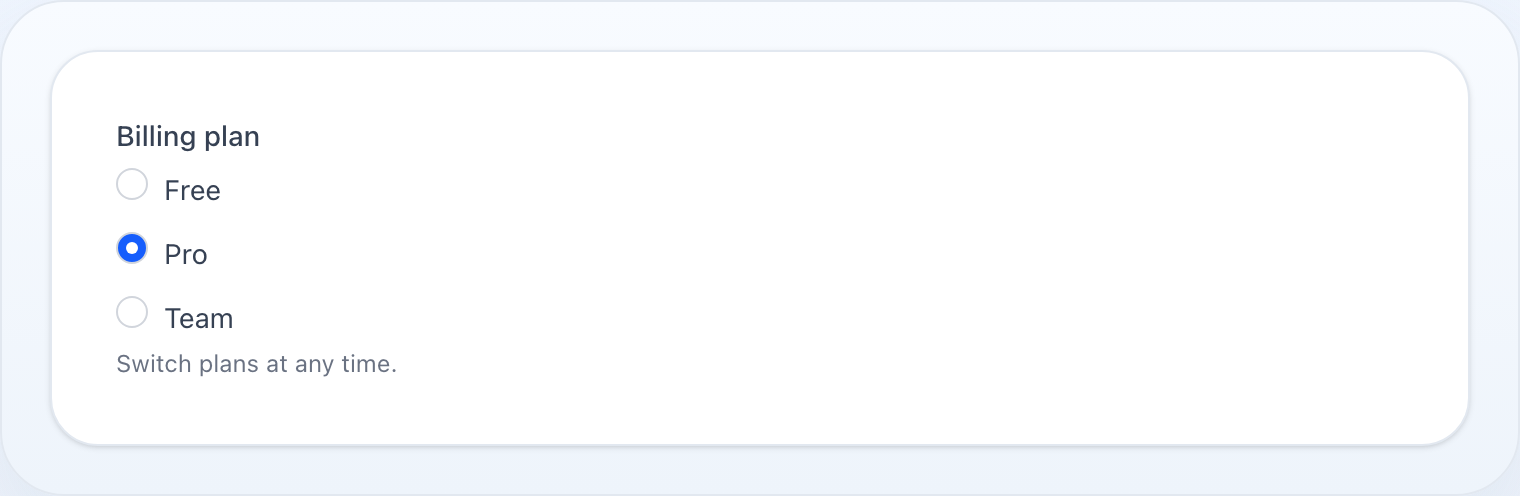
Radio button group for single-choice selection.
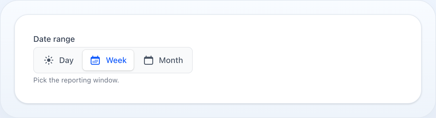
A compact segmented control — a pill highlight slides over a shared track.
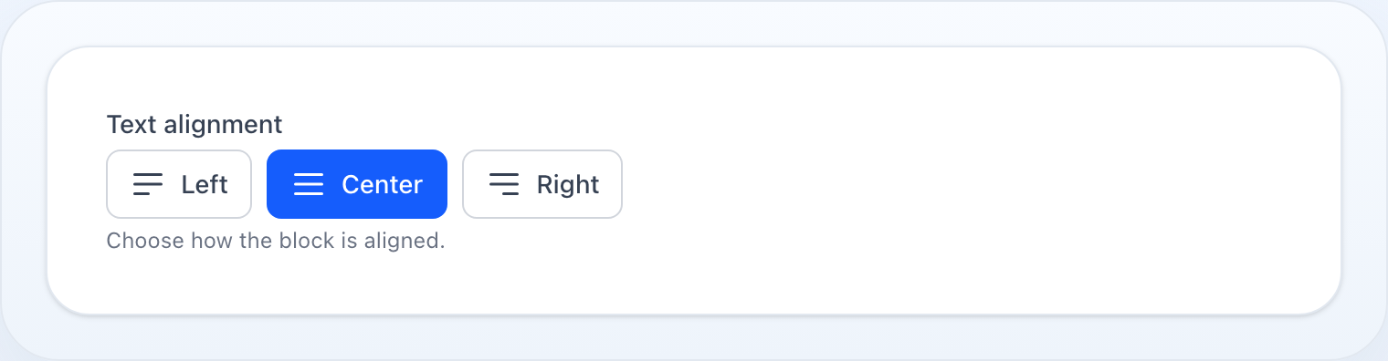
Separate buttons; the selected one is filled with the accent color.
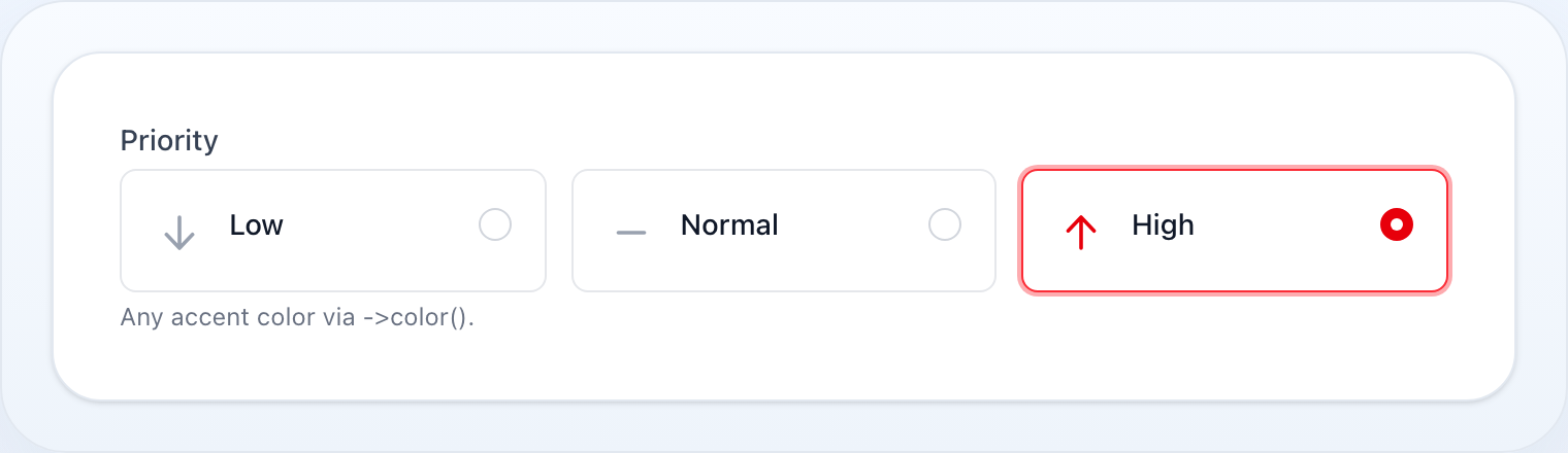
Every variant tints the selected option with ->color() — here a row of danger-colored cards.
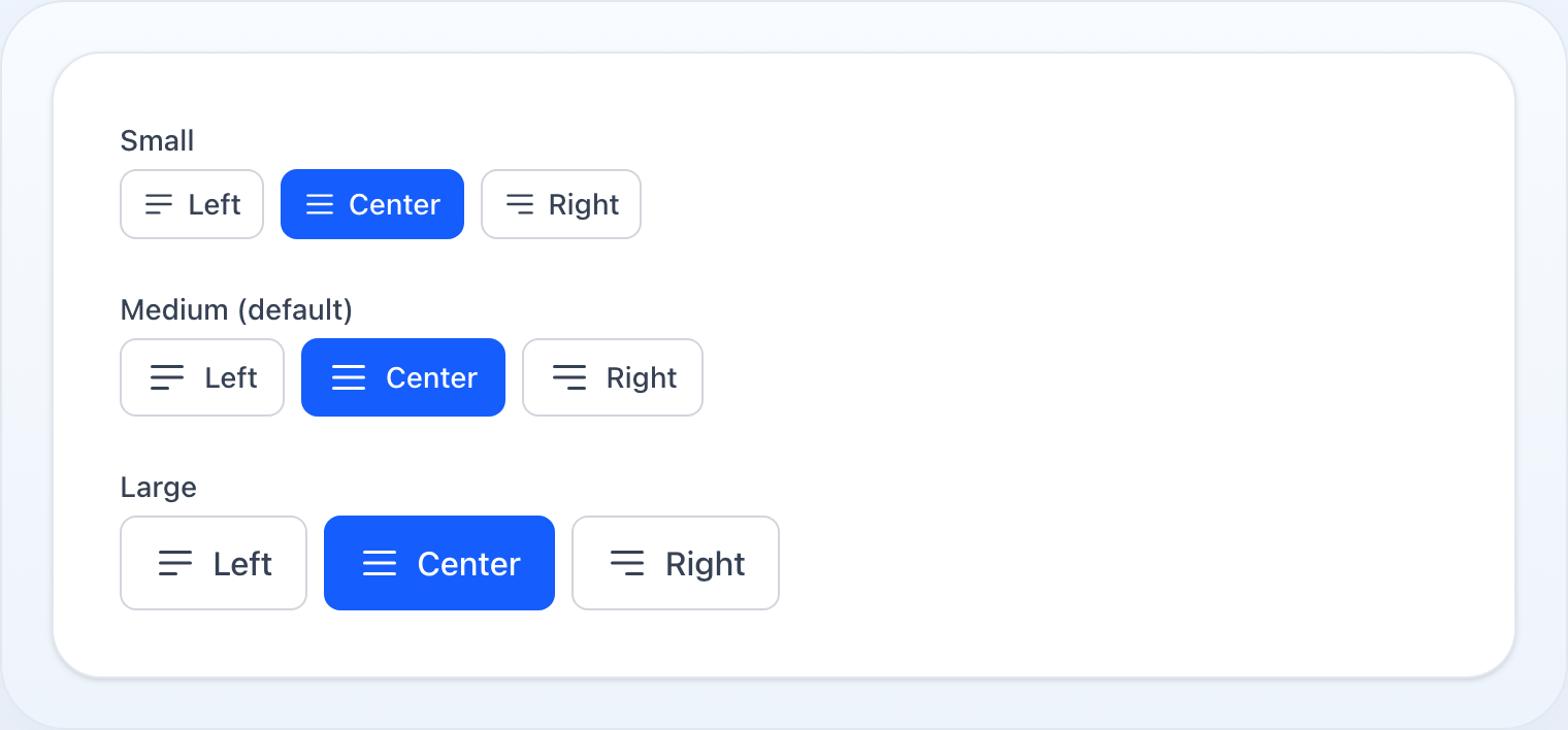
The segmented and buttons variants scale with ->sm() / ->md() / ->lg().
On this page
Radio button group for single-choice selection.
use NyonCode\WireForms\Components\Radio;Usage
Radio::make('priority') ->options([ 'low' => 'Low', 'medium' => 'Medium', 'high' => 'High', ])Dynamic Options
Radio::make('plan') ->options(fn () => Plan::active()->pluck('name', 'slug')->toArray())Enum Options
Pass a PHP enum class to expand its cases into value => label options. Labels come from
getLabel() when the enum implements Foundation\Contracts\Enum\HasLabel, otherwise the
case name is headlined. The field is also auto-constrained to the enum's values with an in:
rule. See Select › Enum Options for details.
Radio::make('status')->options(Status::class)When the enum also implements Foundation\Contracts\Enum\HasIcon or
Foundation\Contracts\Enum\HasColor, each case's icon and accent color are picked up
automatically from ->options(Enum::class) — no ->icons() / ->colors() call needed.
Explicit ->icons() / ->colors() entries still win over the enum-derived ones.
enum Plan: string implements HasLabel, HasIcon, HasColor{ case Free = 'free'; case Pro = 'pro'; public function getLabel(): ?string { /* … */ } public function getIcon(): string|Icon|null { return match ($this) { self::Free => Icon::gift, self::Pro => Icon::star, }; } public function getColor(): string|Color|null { return match ($this) { self::Free => Color::Gray, self::Pro => Color::Success, }; }} // Icons + per-option colors both come straight from the enum:Radio::make('plan')->options(Plan::class)->cards();Descriptions
Radio::make('plan') ->options([ 'free' => 'Free', 'pro' => 'Professional', ]) ->descriptions([ 'free' => 'Limited features, no support', 'pro' => 'All features, priority support', ])Dynamic descriptions:
Radio::make('plan') ->options(fn () => Plan::pluck('name', 'slug')->toArray()) ->descriptions(fn () => Plan::pluck('description', 'slug')->toArray())Inline Layout
Radio::make('size') ->options(['s' => 'S', 'm' => 'M', 'l' => 'L']) ->inline()Card Variant
->cards() renders each option as a selectable card (FluxUI-style). Cards stack
vertically by default; add ->inline() for a horizontal row.
Radio::make('plan') ->options(['free' => 'Free', 'pro' => 'Pro', 'team' => 'Team']) ->descriptions([ 'free' => 'For personal projects.', 'pro' => 'For growing teams.', 'team' => 'Advanced controls & SSO.', ]) ->cards()Cards With Icons
Provide a value => icon map (or let a HasIcon enum supply them automatically — see
Enum Options).
Radio::make('plan') ->options(['free' => 'Free', 'pro' => 'Pro', 'team' => 'Team']) ->icons(['free' => 'gift', 'pro' => 'star', 'team' => 'user-group']) ->cards()Cards Without Indicators
Hide the radio dot on each card — selection is shown by the highlighted border only.
Radio::make('plan') ->options([...]) ->cards() ->hideIndicator()Segmented Variant
On narrow screens the segments stretch equally across the full track (wrapping
rows stay full-width); from the sm breakpoint up the control keeps its
intrinsic width.
->segmented() renders a compact segmented control — a pill highlight slides over a
shared track. Icons are supported here too.
Radio::make('range') ->options(['day' => 'Day', 'week' => 'Week', 'month' => 'Month']) ->segmented()Buttons Variant
->buttons() renders each option as a separate button; the selected one is filled with
the primary color. Buttons stack vertically by default — add ->inline() for a row.
Radio::make('alignment') ->options(['left' => 'Left', 'center' => 'Center', 'right' => 'Right']) ->icons(['left' => 'bars-3-bottom-left', 'center' => 'bars-3', 'right' => 'bars-3-bottom-right']) ->buttons() ->inline() // side by side; omit for a vertical stackIcons work in every variant — the default list,
cards,segmented, andbuttons— whether set via->icons([...])or derived from aHasIconenum.
Size
The button-like variants (segmented, buttons) accept a size through the shared HasSize
API: ->size('xs'|'sm'|'md'|'lg') or the ->sm(), ->md(), ->lg() shortcuts (default md).
Padding, font size, and the option icons all scale together.
Radio::make('range') ->options(['day' => 'Day', 'week' => 'Week', 'month' => 'Month']) ->segmented() ->sm() Radio::make('alignment') ->options(['left' => 'Left', 'center' => 'Center', 'right' => 'Right']) ->buttons() ->lg()Color
Tint the selected option with ->color() (or a Color enum). It applies to every
variant — the native radio accent, the segmented label, the buttons fill, and the card
border/ring/icon/indicator. Default is primary.
use NyonCode\WireCore\Foundation\Colors\Color; Radio::make('plan')->options([...])->cards()->color('success');Radio::make('align')->options([...])->buttons()->color(Color::Danger);Supported colors: the full Tailwind palette — the semantic roles (primary, success, danger, warning, info, gray), every raw hue family (blue, green, red, yellow, cyan, slate, zinc, neutral, stone, orange, lime, teal, sky, indigo, violet, purple, fuchsia, pink, rose) and the adaptive achromatic endpoints (white, black). The literal hues are distinct from the semantic roles — blue ≠ primary, green ≠ success, yellow ≠ warning.
Per-option colors
Give each option its own accent with ->colors([value => color]), or let a HasColor enum
supply them from ->options(Enum::class) (see Enum Options). A per-option
color wins over the group ->color(); options without one fall back to it.
Radio::make('priority') ->options(['low' => 'Low', 'normal' => 'Normal', 'high' => 'High']) ->colors(['low' => 'gray', 'normal' => 'info', 'high' => 'danger']) ->cards()Boolean
Radio::make('newsletter') ->boolean() // Yes/No options (uses translation keys wire-forms::fields.yes / no)Live Updates
Radio::make('delivery_method') ->options([...]) ->live() // re-renders the form on every changeMethods
| Method | Type | Description |
|---|---|---|
options(array|string|Closure) |
array | Option list, or an enum class (value => label) |
descriptions(array|Closure) |
array | Per-option description text (value => description) |
icons(array|Closure) |
array | Per-option icons (value => icon); auto-derived from a HasIcon enum |
cards(bool) |
bool | Render options as selectable cards |
segmented(bool) |
bool | Render options as a segmented control (pill over a track) |
buttons(bool) |
bool | Render options as separate buttons (selected filled) |
size(string) / sm() / md() / lg() |
string | Size of the segmented/buttons variants (xs/sm/md/lg, default md) |
color(string|Color) |
string | Group accent color of the selected option, all variants (default primary) |
colors(array|Closure) |
array | Per-option accent colors (value => color); auto-derived from a HasColor enum |
indicator(bool) |
bool | Toggle the radio dot on cards (default true) |
hideIndicator() |
— | Hide the radio dot on cards |
inline(bool) |
bool | Display options horizontally (row of cards/buttons when combined with cards()/buttons()) |
boolean() |
— | Shorthand for Yes/No radio group |
default(mixed|Closure) |
mixed | Pre-selected value |
disabled(bool|Closure) |
bool | Disable all radio buttons |
required() |
— | Mark as required |
live() |
— | Trigger Livewire update on change |
See Common Field API for label, hint, tooltip, and other shared methods.