Forms
DateTimePicker
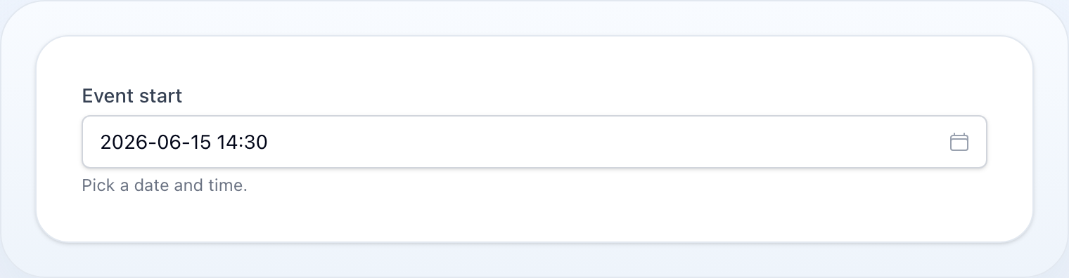
Unified date/time picker with date, month, time, and datetime modes.
On this page
Unified date/time picker with date, month, time, and datetime modes.
use NyonCode\WireForms\Components\DateTimePicker;Modes
// Date onlyDateTimePicker::make('birth_date')->asDate() // DateTime (default)DateTimePicker::make('event_at')DateTimePicker::make('event_at')->asDateTime() // Time onlyDateTimePicker::make('alarm')->asTime() // Month + year only ("YYYY-MM")DateTimePicker::make('period')->asMonth() // Explicit mode setterDateTimePicker::make('x')->mode('date') // 'date', 'month', 'time', 'datetime'
asMonth()always renders the browser-native<input type="month">— the custom calendar has no month-only grid — so it stays native even if you pass->native(false).
Date Constraints
DateTimePicker::make('start') ->minDate('2024-01-01') ->maxDate('2025-12-31') ->disabledDates(['2024-12-25', '2024-12-31']) ->firstDayOfWeek(1) // Monday ->closeOnDateSelection()Bounds take anything readable as a date — a Carbon/DateTimeInterface, or a
string such as '2026-07-10', '10.07.2026', 'today' or '+1 week' — and are
reshaped for the widget behind the scenes. A bound that cannot be read at all
throws, rather than being silently dropped by the browser.
DateTimePicker::make('start') ->minDate(now()) // no past dates ->maxDate(now()->addYear())On a datetime picker a bound may also carry a time, which then limits the
clock on that boundary day only:
DateTimePicker::make('slot') ->minDate('2026-07-10 08:30') // 10 July cannot start before 08:30 ->maxDate('2026-07-20 17:00') // 20 July cannot run past 17:00A day-granular upper bound covers the whole day: ->maxDate('2026-07-20')
leaves 20 July selectable up to 23:59.
Time Options
DateTimePicker::make('meeting') ->withSeconds() ->hoursStep(1) ->minutesStep(15) ->secondsStep(30)Format
DateTimePicker::make('date') ->format('Y-m-d') // storage format ->displayFormat('d.m.Y') // display format ->timezone('Europe/Prague')
format()andtimezone()are opt-in and apply on save. Left unset, the value is stored exactly as the widget produced it — so adding them to an existing field is a deliberate change of what lands in the column, never a silent one.timezone()converts in both directions and only fordatetime: a bare date or time is a wall-clock value that a conversion would corrupt.
displayFormat()uses PHPdate()tokens and only changes what the user sees — the stored value is untouched. It is honoured by the custom picker; a native input's display format belongs to the browser and the user's locale.
Native Picker
The custom Alpine picker is the default. Opt out to the browser's own control:
DateTimePicker::make('date') ->native() // use the browser-native picker ->native(false) // back to the custom picker (default)The only exception is asMonth(), which is always native.
Methods
| Method | Type | Description |
|---|---|---|
mode(string) |
string | Set mode: date, month, time, datetime |
asDate() |
— | Alias for mode('date') |
asTime() |
— | Alias for mode('time') |
asMonth() |
— | Alias for mode('month'); always native |
asDateTime() |
— | Alias for mode('datetime') |
format(string) |
string | Storage format (Carbon compatible) |
displayFormat(string) |
string | Display format shown to the user |
minDate(string|DateTimeInterface|Closure) |
string | Earliest selectable date; may carry a time on a datetime picker |
maxDate(string|DateTimeInterface|Closure) |
string | Latest selectable date; a day-granular bound covers the whole day |
disabledDates(array|Closure) |
array | Dates that cannot be selected |
firstDayOfWeek(int) |
int | 0=Sunday, 1=Monday |
closeOnDateSelection() |
bool | Close picker after a date is selected |
withSeconds() |
bool | Show seconds column in time picker |
hoursStep(int) |
int | Hour increment step |
minutesStep(int) |
int | Minute increment step |
secondsStep(int) |
int | Second increment step |
timezone(string) |
string | Show the value in this timezone and convert back to the app timezone on save; datetime only |
native(bool $native = true) |
bool | Use the browser-native control instead of the custom picker (default: false) |
disabled(bool|Closure) |
bool | Disable the picker |
readOnly(bool|Closure) |
bool | Read-only mode |
required() |
— | Mark as required |
live() |
— | Trigger Livewire update on change |
See Common Field API for label, hint, tooltip, and other shared methods.