Forms
CheckboxList
Many checkboxes from one options array, with search, bulk toggles and groups for when the list is long.
On this page
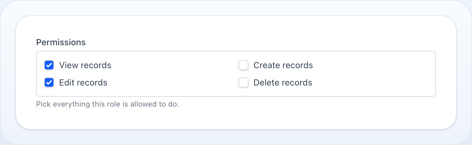
Multiple checkboxes from an options array.
use NyonCode\WireForms\Components\CheckboxList;
Usage
CheckboxList::make('permissions') ->options([ 'create' => 'Create', 'read' => 'Read', 'update' => 'Update', 'delete' => 'Delete', ]) ->columns(2) ->searchable() ->bulkToggleable()
Dynamic Options
CheckboxList::make('roles') ->options(fn () => Role::pluck('name', 'id')->toArray())
Enum Options
Pass a PHP enum class to expand its cases into value => label options. Labels come from
getLabel() when the enum implements Foundation\Contracts\Enum\HasLabel, otherwise the
case name is headlined. See Select › Enum Options for details.
CheckboxList::make('permissions')->options(Permission::class)
Multi-Column Layout
CheckboxList::make('features') ->options([...]) ->columns(3)
Search
CheckboxList::make('permissions') ->options([...]) ->searchable() ->searchPrompt('Filter permissions...')
What Is Selected
showSelected() puts the chosen options above the list as chips, each one
removable.
CheckboxList::make('permissions') ->options([...]) ->searchable() ->showSelected()
This is the half a checklist gives up to a multi-select. A long list only shows the rows near the scroll position and a searched one only the matches, so in both cases "what have I actually picked" is off screen — and clicking a chip is the fastest way to undo a wrong tick without hunting for it in two hundred rows.
The chips read the field's state, not the ticked boxes, which is what makes
them survive a filter that removes those boxes from the page. They keep the order
the options were declared in rather than the order things were ticked: a chip row
that reshuffles itself as somebody works down a list is harder to read than the
list it summarises. With nothing selected the row is absent entirely, and a
disabled() list gets no remove buttons.
Off by default — on a list of five options it is a second copy of the same five words.
Bulk Toggle
CheckboxList::make('permissions') ->bulkToggleable() ->selectAllLabel('Select All') ->deselectAllLabel('Deselect All')
Both toggles act on what the search left, and leave the rest alone. With
invoices typed, Select all adds the matching options to whatever is already
selected, and Deselect all removes only those — a control that acted outside
what it is pointed at is the oldest way a bulk action becomes an accident, and on
a permission list that accident grants or revokes everything.
With nothing typed the matches are every option, so an unfiltered list behaves exactly as you would expect: everything, or nothing.
Grouped Options
When using groups(), each key is a group heading and its value is an array of value => label pairs.
CheckboxList::make('permissions') ->groups([ 'Posts' => ['create_post' => 'Create', 'edit_post' => 'Edit', 'delete_post' => 'Delete'], 'Users' => ['create_user' => 'Create', 'edit_user' => 'Edit'], ])
Calling groups() automatically enables the grouped layout — and an empty map
renders flat, so declining to group is the same call with nothing in it. You
can also call grouped() explicitly.
With searchable(), a group goes when its options go. Filtering hides each
option row on its own; a heading left standing over nothing reads as a group that
failed to load, so the heading carries the same condition its options do.
Toggle-Button Variants
Where the list is short, the same options read better as a row of toggle buttons
than as a column of checkboxes. segmented() and buttons() render the exact
chrome of the matching Radio variants — this is the multiple-choice
half of that shared vocabulary, so a single-choice and a multi-choice control
look alike:
CheckboxList::make('days') ->options(['mon' => 'Mon', 'tue' => 'Tue', 'wed' => 'Wed']) ->segmented() CheckboxList::make('roles') ->options(['admin' => 'Admin', 'editor' => 'Editor']) ->buttons() ->inline() ->icons(['admin' => 'shield-check']) ->colors(['admin' => 'danger'])
These variants show the options alone: search, bulk toggle, grouping and columns are list chrome and do not apply.
Methods
| Method | Type | Description |
|---|---|---|
options(array|string|Closure) |
array | Option list, or an enum class (value => label) |
columns(int) |
int | Number of columns (default 1) |
searchable(bool) |
bool | Enable filter-by-label search box |
searchPrompt(string|null) |
string | Placeholder for the search input |
showSelected(bool) |
bool | Show the chosen options as removable chips above the list |
bulkToggleable(bool) |
bool | Show select-all / deselect-all controls |
selectAllLabel(string|null) |
string | Label for the select-all button |
deselectAllLabel(string|null) |
string | Label for the deselect-all button |
grouped(bool) |
bool | Enable grouped layout |
groups(array|Closure) |
array | Group definitions (also enables grouped layout) |
default(array|Closure) |
array | Pre-selected values |
disabled(bool|Closure) |
bool | Disable all checkboxes |
required() |
— | Mark as required |
live() |
— | Trigger Livewire update on change |
See Common Field API for label, hint, tooltip, and other shared methods.